Creating “Close to Hand”
I love to illustrate the work of an evocative author because I’m often presented with the opportunity to paint an image I might not have otherwise considered.
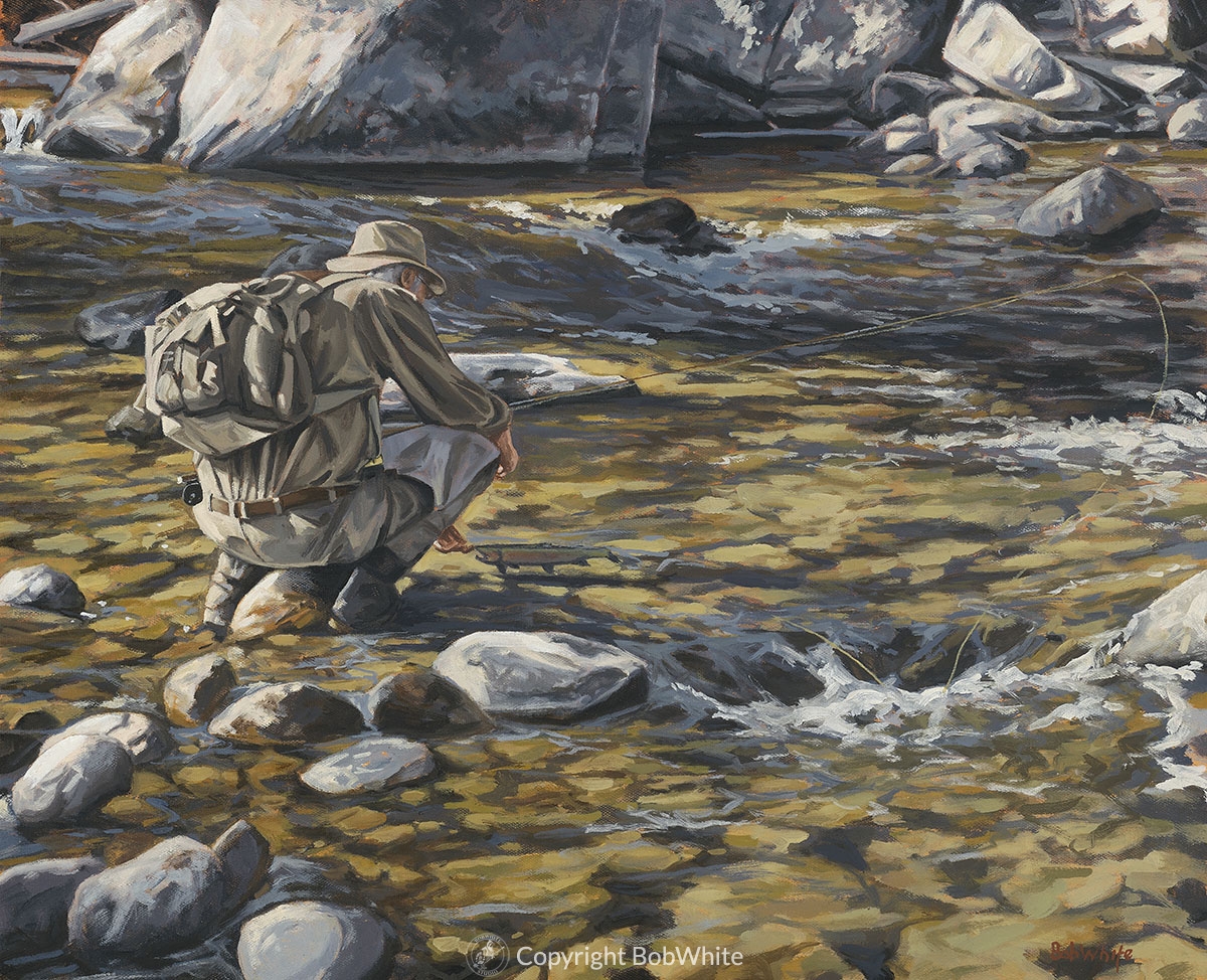
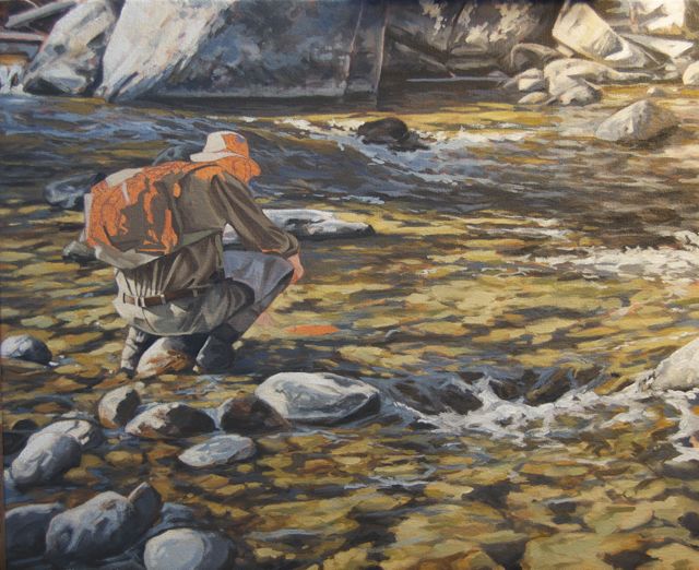
A recent column by John Gierach speaks of what makes a day of fishing good or bad, and the meaning of bringing a good fish to hand, or losing it at the last minute. And, does it really matter?
Click images to enlarge.
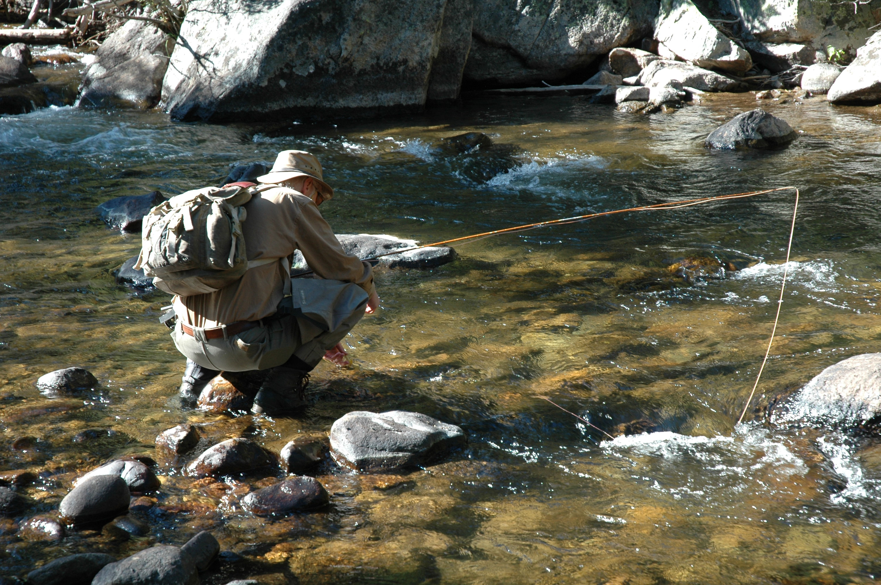
I had just the right photograph to work from, taken a few years ago when John and I spent time tramping around on his home water, one of the most beautiful rivers I’ve ever fished.
I was drawn to this image for two reasons; it fits the story, as John is about to release a good fish. And, most compelling to me, it presents an opportunity to paint the translucent dance of reflected light on water. I love to paint reflected light, even more so when there is no reference to its source, the sky.
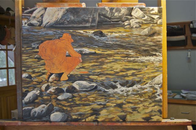
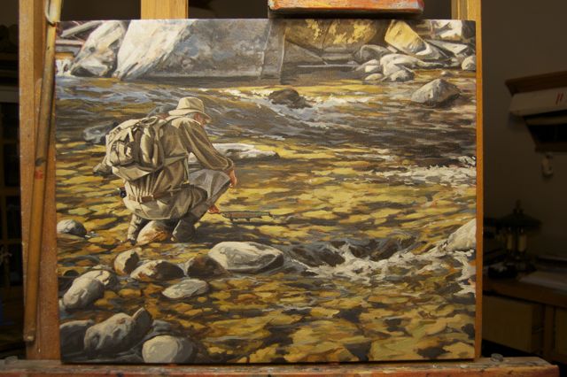
The first step in the process is to choose the scale and format of the canvas. This is determined by the editorial needs of the magazine. The composition needs to be horizontal in format, and a 22” x 18” (roughly 3 x 2) canvas fits the page well.
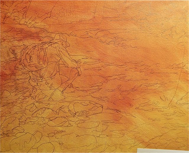
The drawing
Once stretched and primed, the canvas is painted with a ground of alizarian crimson and Naples yellow. My good friend, the painter Rick Harrington, taught me this old master’s trick. The small spots of yellow, orange, and red ground left unpainted create harmonic energy, particularly when next to complementary hues.
A drawing of the image is then done in pencil on top of the ground. I like to paint from a careful and accurate drawing. The more complete the drawing, the less I need to worry about compositional elements or accuracy. I prefer to work these issues out, well in advance, so all I have to worry about when I paint is the pushing around of color.
First brush strokes
The first brush stroke is always a leap of faith.
Establishing extremes in value
I paint in the same manner that I live my life. A lot of what I do, and how I do it is highly intuitive, which is another way of saying that I don’t really have a plan.
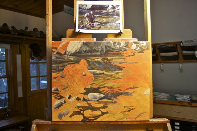
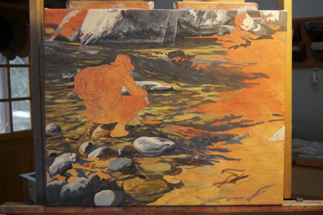
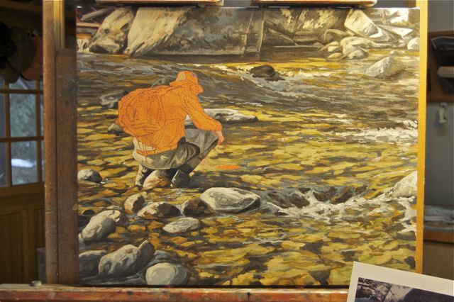
But, one of the first things I always do with a new painting is to establish the extremes of value, the lightest light and the darkest dark. In this case they lie mostly in the strong, sunlit and shadowed rocks. I lay in these values first.
Giving form and weight to sunlit rocks
Once the extremes are established, I begin to model the rocks giving them a sense of form and weight.
Pulling and pushing values
One of the nice things about working in oils, as opposed to watercolor, is the ease in which one can pull values back, or push them forward. In this case the darks in the foreground shadows were too dark, so I’ve pulled them back, making them a bit lighter, and warmer.
Creating the illusion of detail
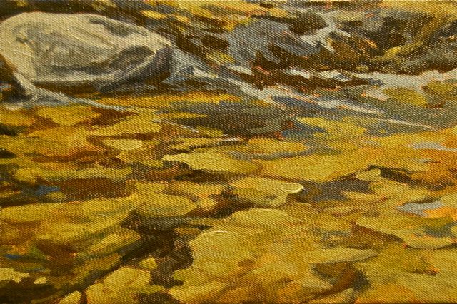
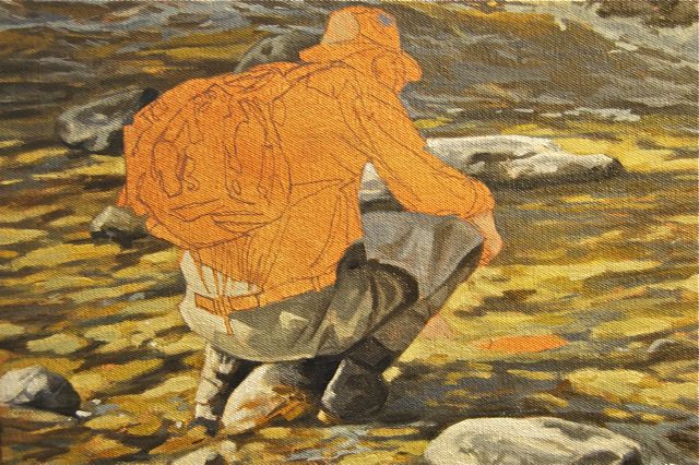
I sometimes feel the need to get one part of a painting ‘right’ and use it as a gauge for the rest. In this case, I’ve taken the foreground rocks to a place where I want them. They’ll all be adjusted and tweaked many times before this painting is wrapped up, but getting something to this stage helps boost my confidence for the next step; painting the forms of the sunlit rocks distorted by the flow of water.
Painting distortion is a lot of fun for me… akin to creating an abstract painting that makes visual sense only when one steps away from it. The key to this process is not to paint the details, but to create, with painterly marks, the illusion of detail.
To take full advantage of the orange ground, I avoid painting right up to the edge of the forms, leaving random bits of the orange to remain throughout the painting.
Color and form to create detail
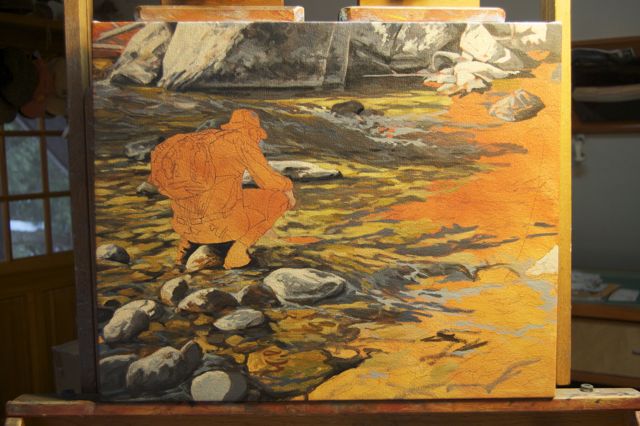
The next step will also be a lot of fun. Probably my favorite part of this painting will be the rendering of the sunlit rocks that are submerged, and the shadows that define them.
What’s fun and interesting is this; it won’t work to paint the individual rocks… that’s not what one really sees. A painter must divorce himself from what he knows is there, abstract what he sees, and reduce the image to simple shapes, colors, and values.
He needs to understand exactly what he’s “seeing”.
Painting what’s really there
I try to forget that I’m painting rock. Instead, I concentrate on ‘seeing’ the undulating forms of warm browns and ochers, where the river bottom is in sunlight, and the cool browns, greys, and blues, where it’s in shadow.
It’s important that I consider all of the visual cues when deciphering the complexity of the scene. To be accurately communicated, all of the visual information has to be fully understood.
For example, the rhythmic relationships between the shapes indicate the depth, speed, and direction of the water.
The shadows on the bottom of the stream give weight and form to whatever has cast them. They also offer information about the time of day, the weather, the season, even the altitude.
The movement of the water over the bottom of the stream creates angled planes on the surface, which reflect light from the unseen sky.
When the water is turbulent enough to distort and break the surface, foam and bubbles are created, intensifying the reflection of the sky into a white light.
With all this in mind, I pick up a brush, begin to mix colors, and get to work.
Flake white
I usually don’t paint with a true white, choosing instead ‘umber foundation’ as my lightest color. This foundation is used to lighten the values of other colors, and used straight, to paint highlights. In this way, I always have a brighter white to use when I really need something to pop.
Recently, after hearing me grouse about how hard it is to find, ‘flake white’ (because it’s made with lead) a friend of mine sent me a tube.
Hot white light
I use a small amount of it to lighten the leading edges of sunlit objects, increasing the effect of reflected white light from the high, mid-day sun.
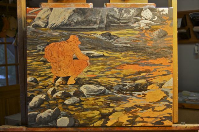
Wrapping up the water
And so it goes. I mix some colors, make a few marks, step back and see how they play, and adjust them where needed. The process is a bit like doing a big crossword puzzle, the further along you go, the easier the next answer becomes. The progression becomes mesmerizing and I lose hours, whole afternoons and nights… until finally, everything comes together, and another step has been taken.
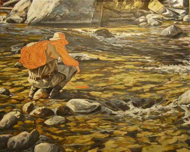
Everything will be tweaked, but for the most part… the water is finished.
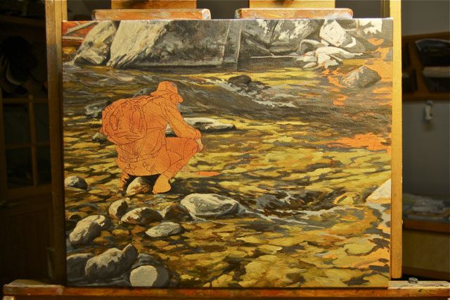
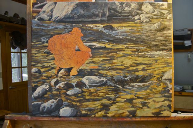
Waders and boots are painted and tied to the landscape through the shadows cast upon it
Next, I paint my friend, John.
Two full days are spent painting the figure and the ancillary objects; the rod, reel, fly line, and the fish which is about to be released.
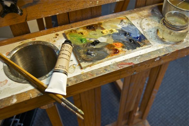
There are two methods to manage a palette. The first is to ‘pre-mix’ all the color needed to complete the painting. Some painters, like the illustrator, James Gurney, not only pre-mixes color, but also establish a full range of values within each color. Essentially, mixing the entire painting on the palette prior to touching a brush to canvas. I know it makes sense to do this… but I’m much too impatient. I want to get at it!
The second method of pallet management is to ‘free-mix’ color as it is needed. I find this method is best suited to my habit of ‘doing things on the fly’. While there’s a certain spontaneity that occurs using this method, it can however, be difficult to match exact colors and values when the need arises.
I used the ‘free-mix’ method for painting the landscape because the water and rock is a kaleidoscope of color and value. There wasn’t one passage, or color, that needed to be exactly duplicated.
Detail
Painting the figure, however, necessitates more control and consistency. I’ll need enough of the necessary premixed base-colors to finish certain passages, such as the waders, pants, and shirt. So, I start by spending a bit of time mixing colors on my palette.
I mix pools of color for each passage I’ll need, and will add my chosen dark or light to adjust the values as I go. It’s a compromise that works for me.
I treat the figure in much the same way as the rest of the painting. I begin by establishing the extremes of the values. An accurate range of values will create the illusion of detail I want… but in a painterly manner, without laboring over every little item.
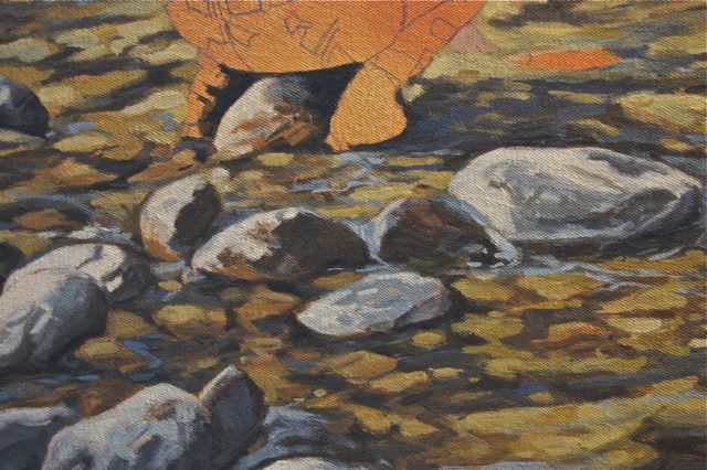
I begin with the waders and boots because I can tie them to the landscape and make adjustments to the shadow cast by the figure. This is important because if this transition isn’t believable, it will look as if the figure is cut out and pasted into the landscape.
Hot overhead light
The sunlit area of the shirt and pants are so bright, and similar in value, that I got a little ahead of myself and began to paint them both.
The bright, sunlit areas on the pants are a perfect example painting what you actually see. The light is so hot that there are no demarcations between details… and paradoxically the effect of this detail is achieved by not painting any.
 Since the sunlit areas are all portrayed in my brightest color, foundation umber, I use up what’s left of that color on my brush by pushing it around the hat and backpack.
At this point I get into a zone and push ahead, forgetting to record each step with the camera. I’m so excited about the painting, and where it’s going, that before I know it, the figure and the fish are finished. Looking back on it, I felt a need to make the connection between John and the trout.
The fish is ‘finished’ by creating the shadow that it casts. Doing so changes everything. What was, a moment before, a fish floating in air, becomes a fish suspended in water.
 All that’s left to do are the remaining ancillaries, the rod and line.
After these are painted, I fuss around and make minor adjustments that aren’t needed, and serve no purpose. They contribute nothing of value to the painting.
While I struggle with the realization that the painting is finished, looking for more things to fix, I remember highlighting areas of the rocks with flake white. I prepare to do the same to the figure, but a quiet voice says, “no”. While I have no rational reason not to highlight the figure, I’ve learned, the hard way, to listen to that inner voice when I paint.
Sometimes finishing a painting is a lot like raising a child; the hardest (and often most important) part of the process is letting go and allowing them stand on their own.


